
Team Time Log – time spent on other students’ sites (must have 3 entries or more):
Date: Mar. 10, 08min From: 20:21 pm To: 20:29 pm
Date: Mar. 10, 07min From: 20:32 pm To: 20:39 pm
Date: Mar. 13, 05min From: 17:06 pm To: 17:11 pm
Students Time Log – time spent on other students’ sites (must have 4 entries or more):
Date: Mar. 10, 06min From: 17:10pm To: 17:16pm
Date: Mar. 10, 03min From: 17:18pm To: 17:21pm
Date: Mar. 11, 05min From: 20:21pm To: 20:26pm
Date: Mar. 13, 05min From: 20:41pm To: 20:46pm
Date: Mar. 13, 06min From: 22:53pm To: 22:59pm
Date: Mar. 13, 6min From: 23:12pm To: 23:18pm
Essay I. Summary of your activities in your contents including new contents created
This week, I completed several content, analytics, and site-management activities to strengthen both the user experience and the organization of my website. I created two new audience-focused posts, Netflix’s The Dinosaur, Why Data Quality Matters and also published my HW10 Summary post. In addition, I reviewed my site structure, made sure categories and tags were assigned appropriately, and updated both the general menu and the HWs menu so that content is easy to find for general visitors as well as for the instructor. I also visited other teams’ and students’ sites, spent time engaging with their work, and left comments on posts that stood out to me. On my own site, I logged in as an administrator to review and moderate comments appropriately. The new content I created this week can be accessed here:
Essay II. Summary of your KPI table
My KPI table was designed to connect my website goals with measurable indicators that can be tracked in GA4 and visualized in Looker Studio. A KPI should be a quantifiable measure tied directly to whether a goal is being achieved (Sharma, n.d.), so I focused my table on two main goals: increasing website traffic and visibility, and improving visitor engagement and interaction. For the first goal, I identified KPIs such as views, sessions, and active users because these indicators show whether people are discovering and visiting my content. For the second goal, I focused on user engagement, event count, engagement rate, and bounce-related behavior because these help show whether visitors are interacting meaningfully with the site after arriving. I then aligned each KPI with specific supporting charts and metrics from my dashboard so that the report does not just display numbers, but clearly shows how traffic and engagement can be monitored over time. A KPI is most useful when it is directly connected to a specific objective (Sharma, n.d.), and this table helped me organize the dashboard around those priorities rather than including random metrics.
Table 1. Created by Author
| Goal | KPIs | Metrics / Charts in Looker Studio |
| Increase website traffic and improve the visibility of site content so more visitors discover the homepage and blog posts. | Sessions Views Active Users | Scorecards: Sessions, Views, 28-day Active Users Chart: Sessions by Date |
| Improve visitor engagement so users spend more time interacting with the site and its content after landing on the website. | Engagement Rate User Engagement Bounce Rate | Scorecards: Engagement Rate, User Engagement Chart: Engagement Rate by Landing Page Supporting visual: Bounce Rate |
| Understand where visitors come from and which entry pages are performing best in order to improve content decisions. | Landing Page Performance Country Distribution | Supporting visuals: Landing Page chart and Country chart/table |
Essay III. Summary of your Looker Studio Report with your KPI identified
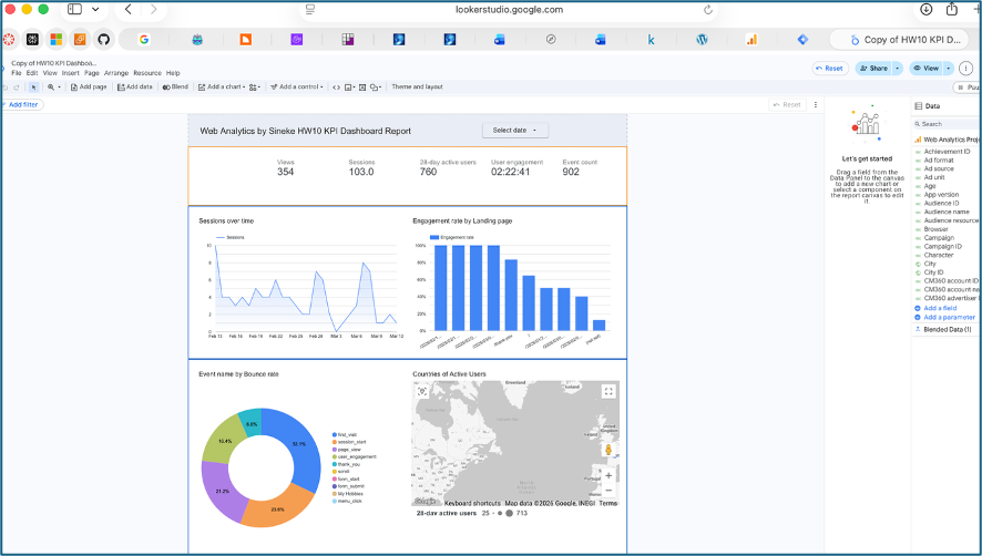
My Looker Studio report was created as a one-page KPI dashboard to provide a visual summary of my website’s traffic and engagement performance. The report includes top-level scorecards for Views (354), Sessions (103), 28-day Active Users (760), User Engagement average time (02:22:41), and Event Count (902), giving a quick overview of overall site activity during the selected time period. It also includes several supporting charts that make the data easier to interpret, such as Sessions over time, Engagement rate by Landing Page, Event name by Bounce rate, Countries of Active Users, and Most common days for new users (Saturday is the most common). Together, these visuals help me evaluate both of my main goals: attracting visitors to the site and encouraging them to interact with the content once they arrive. The report is useful because it combines multiple KPIs and supporting dimensions in one place, making it easier to monitor site health, identify engagement patterns, and understand which pages and visitor behaviors are contributing most to performance. Looker Studio is designed for building easy-to-read, shareable dashboards and reports, which made it an effective tool for presenting my GA4 data in a more meaningful and organized way. Below is a screenshot of my Looker activity, the report is submitted separately as a pdf.
References
Sharma, H. “KPI Meaning, Examples, Calculation & Dashboard Tutorial.” Optimize Smart. https://www.optimizesmart.com/understanding-key-performance-indicators-kpis-just-like-that/
Google Analytics Help. “Engagement rate and bounce rate.” https://support.google.com/analytics/answer/12195621?hl=en&utm
Google Analytics Help. “Analytics dimensions and metrics.” https://support.google.com/analytics/answer/12195621?hl=en&utm


No responses yet